
In the second unit, we will be looking at magazines and magazine designs. We will be creating our own magazine by looking at inspirational magazine designers and other graphic designers and artists.
Content


Meaning
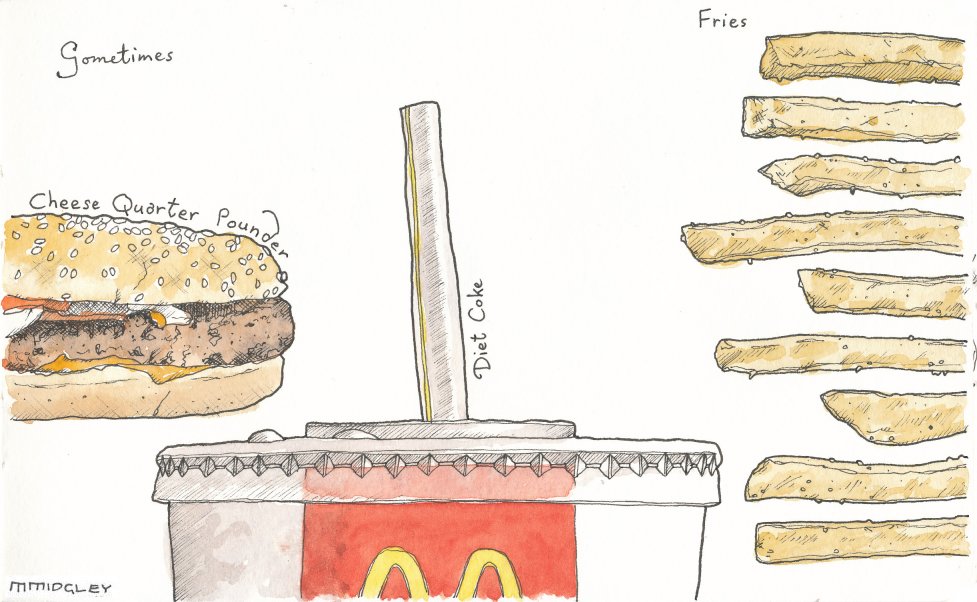
For Matthew Midgley's work i went to his website which shows a lot of his sketches that he has done and also explains the meaning of it and what it is, which is useful. Click here.
I think the work has a theme of fast foods because he has done a lot of illustrations similar to this. The title does inform us about the theme because it is exactly what he has sketched.
For Georgina Luck's work i went to her own website which has all her images and portraits on it. http://www.georginaluck.com/
I think the work has a theme and she did it quite well. She spelt out letters using items from the supermarket to portray a message saying 'Hey, you're having a baby!'.
For Natsko Seki's work i also went to her own website which shows all the work and illustrations she has done. http://www.natsko.com/index.html
Aesthetic
Matthew Midgley has used simple materials to create his illustrations such as a pencil, fine liner, acrylic or watercolour paint. This is because most of his illustrations are just rough sketches of objects. He uses light colours, maybe because he uses a lot of watercolour paint. This does give the idea that it wasn't created to look like it should be detailed. The work isn't that big because it was sketched on a piece of paper. The scale of the work isn't that important. The formal elements in this illustration are line and colour.
Georgina Luck has also used simple materials to create her illustration but are a lot more detailed that Matther Midgley's illustrations. I think she used materials such as pencils, fine liner, acrylic paint, watercolour paint, and photoshop. This is to give the illustrating a better effect especially since it was going to be in the New York Times magazine so it has to look a bit more professional. Georgina Luck uses bright bold colours to attract viewers that are looking through the New York Times magazine. The scale of the image is like an A4 size because it is going in a magazine. The formal elements in this illustration is shape and colour.
Natsko Seki has used a lot of photoshop but also mixed with paint and fine liner and old photographs in which she has suck together to create a new piece. I think on top of sticking photographs she has used photoshop to maybe brighten the colours so it looks more attractive to people viewing the illustration. The formal elements in this illustration are scale, colour and shape.
Personal Response
I have chosen to look at all these pictures because they are the most unique illustrations that they have all created. They are all bold in colour and the shapes and scale of the images are unique to any other illustrations.
No comments:
Post a Comment