Tuesday 23 October 2012
M&M Paris
In this lesson i took a photograph of myself in photobooth and created a clipping mask in photoshop inspired by the work of M&M Paris.
.JPG)
Digital vs Hand made watercolour
 In this lesson, I created our own digital watercolour and hand made watercolour. I used photoshop to create the digital watercolour inspired by the work of Natsuki Otani.
The image to the left is my hand made watercolour. I decided to do something simple and chose a simple word (Wish). To do this i used watercolour paint and a small paintbrush. I first sketched out the wording pencil in bold capital letters. I then carefully used different colour in my watercolour pallet and tried to make it have a watery effect. I don't think it came out as well as i had expected but to improve it i could of added a bit more water so the colours aren't as bold.
 This image is the digital watercolour that i did in Photoshop. I followed the tutorial but also made it my own by adding different colour to each letter and also changing the word from 'Water' in the tutorial to 'Watercolour'
Hand drawn typography and Haworth and Hancock analysis

In this lesson, we looked at Hennie Haworth and James Hancock's typography. We made our own version of their work by painting our hands to make the Capital and the small letter. (e.g A a)
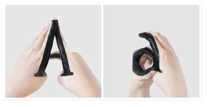
I decided to make a simple letter which is the same shape when it is a small letter and when it is a capital letter.
Here is a picture of my own hand-drawn typography:

To do this i first had to decide which letter i was going to do. I found it difficult to think of a letter which i can change easily from a Capital letter to a small letter so i just decided to do a letter which looks the same in Capital and small which is the letter 'C'. I then used blue acrylic paint to paint on the side of my hand to make it look like the letter 'C'. I took a photograph of it.
Monday 22 October 2012
Reviewing Experiments
- 1. Which materials and techniques have you experimented with during the typography project?
- Bleach and heat pressing our designs on to a piece of cloth.
2. Have you explored and developed your ideas imaginatively? How have you demonstrated this? (give examples, link to posts or include images)
I used a typography experiment that i have previously done in class to heat press on the cloth as my idea.
3. Have you research a diverse range of artwork and completed this on your blog? who have you analysed? is you analysis in-depth? (again give examples and link to posts)
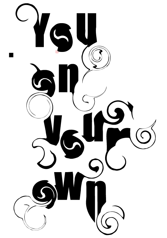
- I analysed Si Scott and the design i chose to do for my heat press was inspired by Si Scott's typography. I researched a lot of his typography with the swirls because it is interesting and you can easily do something similar yourself.
I got some images from: http://www.siscottstudio.com/
4. Have you explored a range of ideas around the theme of 'Sayings and Expressions' within your experiments? What are they? How have they informed your ideas?
- I chose to do a different kind of saying and expression which is quite personal to me. i did 'You on your own.' The meaning behind it for me is that you cannot trust anybody apart from yourself.
5. Have you refined / developed your outcomes through experimentation? How?
6. Have you annotated, in detail, your experiments and developments on your blog and used this information to help you improve?
7. Which techniques / experiments have been most successful? Why?
8. Which techniques / experiments have been least successful? Why?
9. Which techniques / experiments will you be developing further for your final outcome? Why?
10. What else can you do to further develop the techniques / experiments you want to use for your final outcome?
Thursday 18 October 2012
Si Scott Typography
This is my interpretation of Si Scott's typography. His work inspired me to do it in his kind of style but to mess around with the swirls a bit more. I tried to add swirls to the edges of my work to make it look more interesting. I also twisted the O's so the letters itself doesn't look to simple. I stretched out some of the letters such as the N to give it a better effect.
Wednesday 3 October 2012
Kinetic Typography

In this lesson, we created our own typography on illustrator. We did different fonts and effects on the font to either make it more blurry, or bulge out, or stretched.
To create these we used the tutorial that we were given on the Graphics blog.

In-depth analysis Oscar Wilson
CONTENT
The graphic designer that created this work is Oscar Wilson. And this piece s called Gil Scott-Heron, The last holiday A memoir which is a picture of a man that is made out of different words and phrases.
Oscar Wilson was founded in London and specialises in image creation and hand crafted typography. Most of his creations have a meaning towards them because of the words that are written in the image. He may be trying to portray a message to the target audience.
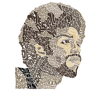
This piece is a Typography and photography piece because he took a photograph of the man and used hand-made typography to fill in all the shapes of the mans face. He's used different shades of brown and black so the features stand out more.
This work is an illustration that has been made for Gil Scott-Heron book cover.
MEANING
Click here for Oscar Wilson's website. This link goes directly to Oscar Wilson's own website of his work which he called 'Studio Oscar.' This contains all of his typography that he has made. It also shows development of the different typography he has created and the names of them. I have also looked at another website that had a lot of Oscar Wilson's work on it. Other website
Portrait and illustration art/Typography because he uses a normal picture of a man and uses hand made typography to finish it off.
I think the work is mainly about a person because it was created for a book cover which is called Gill Scott-Heron: The last holiday, a memoir which is a book about dreams. At the back of the book it says "Dr. Martin Luther King had a dream, Stevie Wonder had a dream, This is a book about dreams". I think the work shows a person that may be related to dreams. Maybe an inspiration idol from the past.
The words that Oscar Wilson uses in the image are "Revolution, New York, We almost lost detroit, Dream, The government you have elected is so inoperative" which i think shows a deeper meaning behind the work which relates to past events that have happened.
AESTHETIC
To create this hand made typography the materials Oscar Wilson used a camera to take a picture of the man or if not he got the image off of the internet. For the hand made typography he used pencil to do a rough sketch, black pen to go over the final outline and colours to get the different shades of brown and black. And to finish it off he used illustrator or photoshop to refine the edges and colours of the typography.
It was made by drawing it out and then refining it in illustrator or/and photoshop. The skills he used were mostly hand made skills so drawing the words in the right position and the right size so all the words and sayings can fit in the image easily.
It's quite small because it was created for a book cover but it is big enough for people to see clearly what the image is and the words that are written inside of it.
It looks like he is trying to use the same colours but different shades so you can still see the image clearly but is also shows that he knows what he was doing because it turned out well. Another key element is the size of the words. He has used different sizes for the different words and phrases used so they all fit in nicely in the image.
PERSONAL RESPONSE
1. Why have you chosen to look at it?
Because i like the way he uses typography as well as imagery of people/things.
What was your reaction to the work?
Surprised
What do you like/dislike about the work?
I like the fact that he has used simple colours that look alike but you can still see the image clearly.
Does this piece remind you of anything?Why?
Have you seen work by another artist/designer that is similar?Who? And what is it that reminds you of their work?

This image is similar because it has the same kind of image in the background. The words are quite smaller. This piece of art is by Sarah King.
Subscribe to:
Posts (Atom)