Thursday 14 February 2013

Matt W Moore


Matt W Moore made the artwork and is the founder of MWM Graphics and has a design and illustration studio. He does a lot of colourful digital illustrations in his own style called "Vectorfunk'. He doesn't have a particular name for this piece but the image is under the category TYPE JAM ARCHIVE # 3 : Various typographic designs (2005–2010) on his own website. This image has been made for his website and to be part of his collection of typography. I have chosen to analyse this piece because it is very colourful and vibrant. It also shows what the typography image looked like before he edited it. It is very creative and unique compared to other typographers mainly because he has used his own style of font and patterns. 

Matt W Moore has his own website in which he puts a lot of his pieces on. I have looked at his website and a lot of different styles of typography he has done. http://mwmgraphics.com/typography_archive_3.html
I think the theme of this work is just creativity because there are a lot of things going on in this piece. Such as the different colours used and the "blobs" in the background. The title also explains the actual piece that he has done which is a graphic design and illustration piece.

The materials that have been used to make this piece are pencil, pen, coloured pens, paint, spray paint and mainly photoshop to make the typography come out more crisp and neat. It was made by firstly drawing out the letters and the background and using paint/spray paint for the colours. I think he then scanned or took a photograph of it and put it in photoshop to edit it to create the piece on the left hand side. The artists uses a wide variety of bright colours to make it look as colourful as possible which is what i think he was trying to portray. But in the edited piece, it looks like he has scratched out a bit of that colour and scribbled all over the typography. The formal elements that are key with this work are colour, texture, shape and pattern. For colour he has used a lot of colour for each shape and each letter. For texture, in the edited picture it looks like he has scratched part of the background which make it look quite rough. For shape he uses a lot of weird free handed shapes (such as blobs and circles). It appeals mostly to a younger audience because of all the shapes and colours. It also shows he's edited in photoshop and illustrator because of all the added lines around the patterns and you can even see the background that they use in photoshop.

I have chosen to look at it because it is quite and inspiring piece. It also uses a lot of colour which is what i like to do in my typography pieces. I would also like to do experiment by doing something similar to this piece. Out of all the work that he has done this one attracted me the most especially because it shows what it looked like before and what it looked like after he had edited it. I like how he has added texture to the edited piece and also the scribbles over the typography. I also like the extra pencil marks that he has added to make it look more like it was quickly hand drawn. There is nothing that i dislike about this piece.

Monday 11 February 2013

Moodboard


Alex Trochut
I like the majority of Alex Trochut's work but i could only fit a few images so i chose these 3 randomly. I like his work because they are all very unique and creative and looks like he spent of lot of time to create these.
http://www.alextrochut.com/#/works/fila
http://www.alextrochut.com/#/works/pepsi-kicks
http://www.alextrochut.com/#/works/the-new-classics

Anna Garforth
I have previously looked at Anna Garforth's work but i do like some of the work she has done is because she used every day materials to create the typography. It also looked very sophisticated and neat instead of colourful.
http://www.annagarforth.co.uk/

Eric van den boom
Eric van den boom does a lot of cartoon and magazine type typography. He also uses a lot of colour but uses dark colours but it still looks creative. He usually does typography on pictures or illustrations of object or people.
http://www.boomartwork.com/work/

Luca ionescu
Luca ionescu uses a lot of photography and editing in her pictures.
http://www.likemindedstudio.com/

Thursday 7 February 2013

In-Depth Analysis


Anna Garforth "Grow"


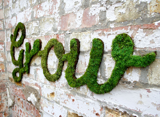
Anna Garforth made this artwork. Anna Garforth is a multi-disciplinary designer in East London. She works at The Plant which is a brand and design agency in Old Street. This work is called 'Grow' which is exactly what is in the image. It shows a photograph of a grown natural typography. It is a landscape and it was created for her own personal use. I have chosen to analyse this piece because it is a good example of creative typography and i would like to include something like this using the same techniques i my final exam piece. However in my exam piece i might choose a different theme. 

I have looked at Anna Garforth's own website to further my understanding of this work. http://www.annagarforth.co.uk/work/grow.html It shows the different pictures that she did relating to this work and also gives a description and title of each piece. I think this work has a theme and that is nature. I think this because she has used natural materials to create the actual typography (plants). Also the word "Grow" suggests nature. The title also gives the theme away to the audience. In the description, Anna Garforth also includes "A self initiated project,searching for hidden, wildspaces around London. Thismall wilderness was lockeaway behind steel gates. Adisused plot of land awaitindevelopment. Its amazing hoquickly the wild reclaims itspace and carries on growineven after it has beedestroyed. However mucconcrete is laid, minecosystems inhabit the gapand push through undeterred." 

The materials she has used for this piece is natural materials such as grass. It was a long process to create these because she had to wait for the actually grass to grow into this shape. 


Here is another piece of work that Ana Garforth has done. She has used similar materials to the first image such as nature but this time to create the actual typography she used masking tape and a wire fence. I think both of the pieces she did are good because they are both have completely different fonts