Monday 28 January 2013

Evaluation of final outcome


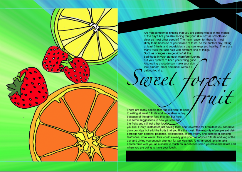
1. Firstly we had to do different tasks which lead to our magazine spread. My favourite was the typography project because you can be the most creative with it. I came up with the ideas by researching artists and doing similar ideas for example i looked at Illustrations that Natsko Seki did and did some similar work such as drawing objects (fruits) and rearranging it to make it look like a collage.

2. The first project we did was typography which was my favourite. We looked at different typographers and experimented and created different types of typography. We then did Illustrations and Photography. The photography project was also good because i am doing Photography so it gave me a bit of an advantage. But for my final piece i looked at Natsko Seki and experimented my pictures in photoshop so it looks the same as her style.

3. Natsko Seki inspired my final outcome because i mostly did illustration in my magazine. I also tried to collage it in a way so it attracts a younger audience (teenagers). I got this image from Natsko Seki's own website www.natsko.com/


4. I think my magazine came out quite well because of all the illustrations and my page spread layout. Also i used a lot of colours to attract the viewer so it looks more creative and interesting.

5. I could of improved the Illustration page and the amount of writing that i put in my magazine because i included a lot of illustrations and photographs.

6. Overall i think the final outcome turned out good but i think i could of improved it a bit more by adding more writing and adding more of my own photographs. I would like to develop editing that i put in photoshop.

Back page advert


Front Cover


Wednesday 23 January 2013

Logos


These are the two logos that i have to choose from for my front page. They are called taste because my magazine mostly contains food. In my opinion i prefer the top logo because it contains a lot of color which will attract the viewer. The text is also bolder and bigger. However the font at the bottom i think is a bit more creative because it also contains the word 'text' all around the logo.

Development for page spread


This is my final page spread for the magazine. I chose to do the fruit because it has more colour and there is more you can do with fruits than fatty foods. I drew the image on the left hand side and edited it in photoshop. Here are the steps of how i put it together.


1. I originally wanted my page to look like this so I firstly changed the title from 'Title' to 'Sweet forest fruit'. I then typed in the text and re-arranged the wording so it would fit in well on the page.


I then drew out on a plain sheet of A4 paper the design i want on my page spread which was fruits. I wanted to do something simple so i just drew an orange, some strawberries and a lime. I first drew it in pencil but i then went over it in a black felt tip pen.


After that, i then scanned in my image and sent it to myself so i could download it onto the Mac. I opened the image in photoshop and used the Magic Wand tool to select the area i wanted to colour. I did this for each area and added colour to make it look like the fruit.


Then i wanted to make a background so i could decide whether the layout looked better as plain white or with a background. To do this i opened a new page in photoshop and chose the gradient tool. I then came out firstly with blue and orange but i wanted to be able to change the colours. So i rasterized it, and changed the hue/saturation to get these colours.


I did the exact same thing (hue/Saturation) to get all these different colours for my background. With each background i placed it behind the fruit image and the text.


Monday 14 January 2013

Completing my feature spread


Moodboard


Page Layout


Fonts


Page Layout


This is my page layout for the magazine. It includes all the things i i will have on my page apart from the background. It includes the title and the font of the title, the text and the font of the text and where the image is going to go. I want to make the image a whole page so it can catch the readers eye and so it will be the first thing they look at. I wanted to put the title between the two different texts so it doesn't look like most other layouts where the title goes at the top. Also the title will be quite big so people will be able to read it. The font i chose for the title is Zapfino and the font i chose for the main text is Arial.

Experimenting with fonts


These are the different fonts that i experimented with in photoshop for my magazine page. I chose different types of fonts so there is a good variety to choose from. The theme i chose was food and i either want to take photographs of foods such as fruits, vegetables, salads etc. (healthy foods).
For a more sophisticated and simple look to the page the fonts i should choose from are Arial, Big Caslon, Brush Script Std, Gloucester MT Extra Condensed, and Times New Roman. These fonts are either large or bold which will stand out but the only disadvantage is if it looks too simple then it won't appeal to many people and the page itself will look dull.

However if i choose to to take photographs of foods such as ice-cream, chocolate, sweets, fries, burgers and pizza (Fatty foods) then the images will be more exciting to look at as it appeals to more people. This means that i can add a lot of colour and patterns to the page and the fonts i should choose from are Ayuthaya, Lucida Blackletter, Orator std, Tamil MN, Cooper std, Handwriting- Dakota, Zapfino and wide latin. The only disadvantage of choosing this path is it might have too much to look at.


Thursday 10 January 2013

Moodboard for final outcome


This is my mood board for my final outcome. I chose to do mostly fruits salads or just different variety of fruits because they are colourful and they will stand out on a A3 page. Also because you can create different shapes with fruits by cutting them are re-arranging them to get the photograph that you want. I chose these photos because they stand out the most and i would like to do something similar for my final outcome. 

I chose to put this image on my mood board because it is well presented and will look professional in a magazine page. A fruit was cut out to make it look like a basket/bowl and other fruits were also put in it. It shows a different variety of bright colours and shapes.

I chose to put this image on my mood board because it is an actual recipe book and i wanted at least one example of a recipe book cover. It is different to a normal recipe book because it is a 'Food art' recipe book cover. 

I chose to put this image on my mood board because it shows different fruits simply in a bowl and it shows a good focus of the fruit so the viewer will be drawn to that first. I will also like to do something similar to this because it is so simple but colourful and interesting to look at. 

I chose to put this image on my mood board because it shows information about the fruit salad. It is from jamie olivers own website.

I chose to put this image on my mood board because it is photographed from a well known artist. Sharon Core. She photographs still life. Also because it isn't a close up image but it shows a lot of different food items on a table. It is different to the other images on my mood board. 

I chose to put this image on my mood board because it is a unique way to take a picture of fruits which is through a glass. I got the image off behance