Thursday 20 December 2012

Layout Development


This is my final Layout for my my Illustration page layout in the magazine. I used an image of my own and 2 examples of these two photographers. I also used different colours for the page to make it stand out instead of just doing a normal plain background.


The first thing i did to create my final page layout is i added two headers which is where the names (Andrea Bricco and Henrick Bonnevier) are going to go. I coloured them in blue. I also made it quite large so i when type the names in, i can make the size large too so it is easy for the viewers to read.


The next thing i do is add the text. For both the titles/names i use 'Lucia Handwriting Italic' font and the size 60 and 72. I chose to use a dark blue colour for the titles so it can stand out on the light blue header.


The next thing i do is add the rest of the background. I placed an orange background in the centre so it it behind the header and font


Thursday 6 December 2012

Photoshoot Experiments


After taking our photoshoot of our objects in the style of Andrea Bricco and Henrick Bonnevier, we experimented with the photographs in photoshop to create different effects. This is the final outcome of the experiments that i tried in photoshop. I changed the hue and the contrast in the photograph. And made the background darker so the colours could stand out more. 


I wanted to change the colour of the items to a darker purple so i went to 'Images' then 'adjustments' and then 'Selective colour' so i can choose the colours that i want to change in the photograph. 


I then cropped the bottom so there is not as much dark space in the photograph.

Magazine photo shoot


Last lessons, we had to get  into groups and look at the work that Andrea Bricco and Henrick Bonnevier have done. Then we had to bring our own objects and do our own photo shoot in the same style as Andrea Bricco and Henrick Bonnevier. We had to think about the background we are going to use, the use of lighting, the camera angles, who will set it up and who will take the photos. To do the style of Andrea Bricco we had to place the items on the black sugar paper and sketch an image on the sugar paper.


We placed all the items we brought on the black sugar paper and set it up for the photo shoot. These are one of the two best images that we took of our object and our own interpretation of Andrea Bricco and Henrick Bonnevier's work. We chose to do purple because it is the colour that most of us have the most and it is a bright colour against the black background. The organisation of the items went well especially for the Henrick Bonnevier interpretation because it looks quite professional and similar to some of the work that Henricl Bonnevier has done. To improve we could of cropped out some of the white in the background so the only thing you can see is the black background. And also in the Andrea Bricco interpretation we could of done a better illustration so it shows a lot clearer in the photographs.

Wednesday 5 December 2012

Illustration Analysis

Henrick Bonnevier

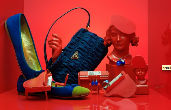
This photograph is our own interpretation of Henrick Bonnevier's work. Henrick Bonnevier mostly takes photographs of products and different brands. His photographs are different to any other photographer because he changes the scale of all the objects. For example the small items are big and the big items are small. He took a lot of photographs for vogue magazine which might might be the reason he takes a lot of pictures of brands like Chanel.

He uses a lot of bright bold colours in his photographs so it can attract viewers. It was obvious that he planned the way he was going to take the photographs because of the way the objects were organised. There is not that much space in his photographs because he wants to fill up the image as much as possible with the object that he is photographing. In our photograph we also tries to uses similar colours on a dark background so they stand out a lot better. The colour we used the most was purple. We also tried to organise our object in the same way that Henrick Bonnevier did.

The majority of his photographs are landscape so it can fit in more than one category. I think Henrick Bonnevier is trying to attract viewers that are women because he mostly photographs object such as shoes, jewellery, perfume, purses etc. The only website that has information to support my reading of the art work is a fashion and photography website in which it just shows some of the photographs that he has taken.
Henrick Bonnevier
Our photograph was also landscape so we can try and limit the amount of space to as little as possible so we can fill the image with all the objects.

I like Henrick Bonnevier's photographs because of the colours that he uses and the object that he photographs. If you would see his photographs in a magazine it would catch the eye easily because of the way he has used dominant bright colours. For example the colour of the items are a bold colour but the background is another bold colour but in a different colour.


The two images are photographs that he has taken. Another reason i like it is because it is not what any other photographer or artist has done. Each object in the photograph are different sizes so it looks unique.


Andrea Bricco

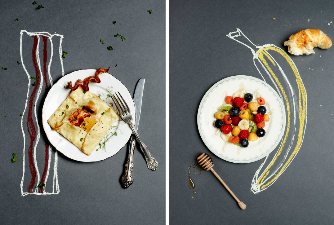
This photograph is our own interpretation of Andrea Bricco's work. Andrea Bricco mostly takes photographs of food and in some of them she does some illustration with the food and takes a photograph of them. We couldn't bring in any food so we decided to do the same style but with different object such as shoes, flowers, nail polish, hair clips, and jewellery. When she takes the photographs she uses a lot of light which is mainly coming from above to everything is lit and there are no shadows. She takes a lot of photographs for magazines and cookbooks. She also uses a plain background in most of her photographs. We tried to do our own illustration on the side to do the same style that Andrea Bricco did.

The website i went to for information about Andrea Bricco's work is http://www.andreabricco.com/#/PORTFOLIOS/projects/11/. It shows her official website in which she has links to her photography of her own work, and other things too.

I like this work because it is very different to all the other photographers and illustrators. I like our own interpretation of her work because it shows a lot of bright and bold colours against a dark background just like the photograph we did similar to Henrick Bonnevier.

Andrea Bricco and Hendrik Bonnevier analysis


Context


Andrea Bricco grew up in a small town in Wisconsin in America and her family had a restaurant where she used to work. She used her images mostly for magazines and features in cookbooks When she took her photographs she mostly used plain backgrounds and changed the direction the light was coming from.

Meaning

In most of her photographs the lighting is coming from above so you can see the illustration better. It also looks realistic and in focus. Her images are very clear because of the angle she has taken the photographs from.

Aesthetic

Andrea Bricco positions her items in a very creative way. She does a quick sketch of the food that she is also photographing. I think she does this because the illustration might help clarify what that food is. Her photographs are linked to Natsko Seki because of the way they both use large scales and the illustrations and images are different sizes.


Context

Hendrik Bonnevier mostly takes photographs for Vogue magazine. He also advertises brands like Chanel in his photographs. Most of the items that he uses are items that women are into. Such as perfume, hats, purses, shoes, handbags etc. His photographs are all landscape so he can fit as many item in one photograph as possible. He uses vibrant and bright bold colours in his photographs so it can attract people when they are looking at it. He used a designed composition so he had already had an idea and planned how he was going to take the photograph of the objects and all the colours he wanted to use. His photographs are quite positive since he uses bright colours. But it can also be a bit too busy because there are so many items in the photograph that it is hard to see what the artist is trying to portray. But on the same note, it is also energetic.


  • Hendrik Bonnevier
  • Social artwork
  • Photographs
  • Vogue magazine
  • advertising brands (Chanel)
  • fits in socially. Social context
  • fashion
  • Interiors


Meaning

  • lighting comes from above
  • realistic
  • in focus
  • clear images
  • Pictures are landscape

Aesthetic
  • food to make pictures
  • illustration might help clarify what that food is
  • use of focus
  • Uses vibrant colours
  • designed composition (planned)
  • Limited colour palette


Personal Response
  • 5 senses
  • link to Natsko Seki work
  • positive image
  • Can be too busy
  • energetic

Monday 3 December 2012

Adverts analysis


  • This image was made to advertise Ben & Jerry's ice cream. 
  • The image uses a lot of bold bright colours to attract viewers to the advertisement. 
  • Uses a lot of chunky bold so it is easy to read.
  • Clearly shows what they are trying to advertise because it has an image of the brand. 
  • Scale of the image was meant to look big
  • Scale of the image is important because it is trying to attract people so they can buy the brand.