Friday 28 June 2013

Miles Donovan


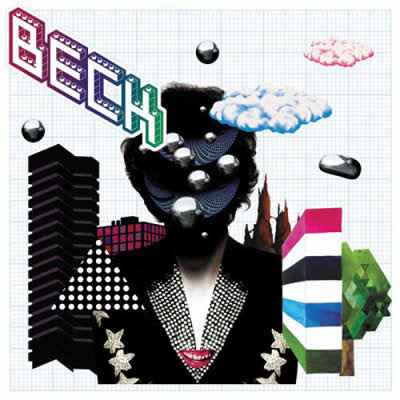
This work was made by Miles Donavan. It is a vector portrait that he has created. He does a lot of different vectors using different colours and different photographs. It has been made to be put on his website in which he shows a lot of the different work that he has done. Each and every piece of work has a different style to it as it uses different shapes and colours and different photographs.
I have chosen to analyse this piece of work because it is a simple vector that uses a lot of different colours and it is quite attractive to the viewer as it is easy to see what the original photograph must have looked like.

The information i have looked at to further my understanding of the work is his own websites in which he has a lot of different work that he has done and shows the kind of style and techniques that he uses to create these vectors. It also gives a lot more information about himself and why he as done the work. And has a link to his own blog. http://www.milesdonovan.co.uk/
I have also looked at another website in which it shows an interview that somebody did with Miles Donovan. This interview has a lot of information about his work and the techniques and materials that he uses. I think he does this work just for his own personal reasons and not because there is a deep meaning behind it. http://www.theartfuls.com/interviews/miles_donovan

The materials that have been used is paint, (spray paint and normal paint) and illustrator. I did my own interpretation of his work and i used a normal photograph and illustrator to create the vector which is what Miles Donovan might have done. The techniques used is using the pen tool and going over the lines of the different shades and tones on the original image.
The artist has used a lot of bright colours such as dark blue, light blue, red, yellow and white. The work is quite small as he just wanted to show it on to his website and his blog for his viewers to see. And the formal elements used in this work is colour.

I have chosen to analyse this piece of work because it is a simple vector that uses a lot of different colours and it is quite attractive to the viewer as it is easy to see what the original photograph must have looked like. My first reaction to the work was that he has used the right colours to really make it look like the original image for example, for the darker shades in the original photograph, he uses a dark blue. I like this work because it does not just change the hue/saturation on the photograph but uses a technique using the pen tool in illustrator to really make it his own. The work has inspired me to do different images and use this technique in illustrator. I can also use different colours as he has demonstrated on his website and on his blog.

The Chemical Brothers: Push The Button


My first reaction to the artwork is that it look like an image in another image. And what does this image mean. I think that the music will sound like alternative rock/ pop because it uses simple colours. The band is called The Chemical Brothers and the genre of music that they make is Alternative Rock. The artwork does reflect the genre of music because the hand in the artwork of this album cover is a sign of power and alternative rock is quite powerful in music now.
Tappin Groften also designed this artwork for their album cover. They also did the cover for Beck and he has his own blog and website in which he shows all the work that he has done for himself, for other people, and just for viewers to look at.
The target audience is mainly for older teenagers and young adults as they are mostly the people
that are interested in Alternative Rock.
They use a quite a lot of typography in this album cover because in the actual front cover of the album it has the name of the album rearranged and shaped into the head. This is quite effective as it looks appealing the the audience.
The kind of materials that have been used is the illustrator to create the typography and illustrations using pen, pencil and colour. And to this this, they may have illustrated the shape of what they want to put the words in.
The colours used are quite simple colours such as blue, black and green which does not look like there is too much going on.

The work is quite effective at portraying a message because they have fitted the text in the shape of what they are trying to show. For example, the hand in the front cover could stand for power and standing up.
The layout is quite simple as it only has the image and the name of the title in the middle and in a small font on the top left hand side of the cover it has the name of the band.
The name of the band has a logo and it is written in a unique kind of font.

Thursday 27 June 2013

Coldplay: X&Y


My first reaction to the work was that it did not seem so clear but it did have a splash of colour on it. The design makes you wonder what it even says and why the artist has chosen to do it. I think the music will be alternative rock and pop just because I know the band Coldplay.
The band is called Coldplay and the genre of the music is alternative rock/ pop. The artwork does not reflect the genre of the music as it is hard to tell what the image on the album cover is and the meaning of it. Tappin Groften (Mark Tappin and Simon Goften) created this album cover art. They were also the creators of Chemical Brothers album cover 'Push The Button'. Tappin Groften has his own website in which you can eaily contact him and shows images of the work he has done.

The target audience i think is mostly for adults as some of their songs have been aimed towards them.
The imagery has been created by the ITA2 encoded alphabet. I do not think this relates to the music.

The kind of materials that have been used to create this is using

Beck: The Information


My first reaction to this album cover was that it was dull and there was nothing on the front. However there are stickers on the inside. I think the music will just be rock or pop music as it has a lot of bright colours and individual illustrations. The band is Beck. And the name of the album is 'The Information'. The genre of music is alternative rock however the artwork and the design of the album cover does reflect this because of the use of loud colours and the illustrations.

Beck is actually the person that created his own album cover along with other people. I think he may of done this so he has his own participation in designing the album cover and to make it his own.
The target audience for this kind of music is young adults as they are most likely to like rock music and the artist himself is quite young.

The imagery and text does relate to the music because the individual illustrations on the other pages are quite sharp and colourful which makes it attractive the the fans and viewers. However the front cover does not really relate to the music as it only has a sticker of the name of the band and graph paper underneath which does not look quite attractive and related to alternative rock music.
The sort of images that have been used are quite abstract images.

The materials used to create this album cover was photographs, and what looks like to be photoshop to make it look more like a cartoon. The techniques used to create this album cover is by photographing and then putting it into photoshop and adding different shapes and patterns to it to really change what the original photograph looked like. The artist uses a lot of colours in the individual illustrations on the other pages to really catch the viewers eye however i think this should be done on the front cover as that is what people look at first. The album cover only uses one font which is a cubed 3D font and is the name of the band. This is done so people can easily spot who's album it is and it stands out quite clearly.


The Shins: Chutes Too Narrow analysis


My first reaction to the work is that there are a lot of bright colours and it is obviously an illustration of a hillside with lakes and chutes. I think the music will be quite country because the cartoon picture on the cover looks like a field and hillside.

The band of this album is called The Shins. The genre of the music that they make is Indie Rock. I do not think that the artwork of the album cover reflects the genre of the music.
Jesse LeDoux made the artwork cover illustration. He is a illustrator and an art director and designer for Sub Pop Records.  He has his own website and his own blog in which he does his own illustrations and illustrations for other people. http://ledouxville.com/ Most of his illustrations are about random things such as shapes, patterns and actual places.

The target audience looks like it is for younger people because of the use of the colours, shapes and different fonts used. The sort of people who listen to music in this genre is mostly older teenagers and young adults as they like the indie rock type of music.

I think some of the imagery and some of the text relate to some of the songs on the album. For example on the back cover there is a small illustration of lips which might relate the the first song which is called 'Kisses the Lipless'. Another example is that there are lot of illustrations of chutes on the front cover and the back cover which has obviously been presented as the album title is called 'Chutes Too Narrow'.  The mood it creates is quite a jolly mood as it has a lot of bright colours and does not look too simple so it does not look boring.

The kind of materials that were used to create this album cover is a lot of pen and coloured pen work just to highlight the colours that will be used, illustrator for the different fonts used and to colour in the illustrations to make sure that it is full with colour. The techniques used is drawing out the illustrations probably in pencil first and then going over it in black fine liner.

The designer of the cover uses a lot of bright colours to really attract fans to buy the album. It also uses a lot of colour because it may relate to the mood of the signs. The work does not really portray any message as it does not have as much information on the cover. Just the title and the illustration.

The layout is quite simple as it has only the illustration, the band name and the title of the album. The biggest thing on the album cover and the thing that viewers are most likely to look at first is the band name as it is at the top and the font is quite big. I think this was done on purpose.


Monday 24 June 2013

Billie Jean Analysis


Billie Jean made this artwork and it is called '30 years of nike basketball shoes'. It is a illustration and billie jean is a illustrating artists. The work has been made to be put on her own website to show the work she has done for her viewers. I have chosen to look at this work because i like the different patterns that she has used and it is quite similar to mark making and a collage.

The websites i have used to further my understanding of the work is her own website in which it gives a lot of example of the work she has done and a description of it. http://www.billiejean.co.uk/gallery.php?i=30_years_of_nike_basketball_shoes The genre of art is installation and illustration. I think the work has a theme of shoes and basketball maybe because she has a love for it. The title does inform us what is about. The title explains that she has done this work because it is celebrating the 30 years of nike basketball shoes. I don't think there is a deeper meaning to her work but it may show the viewers that she is a fan of either nike shoes, basketball, or both.

The materials used is mostly pen as the illustration has been done in blue ink. It was done by sketching some of the pictures relating to what she was trying to portray. And then gone over in blue ink. The artists only uses one colour maybe because she wanted to just show the illustrations. The work is quite small as it was only made for her website.  The formal elements that are key with this work is colour and pattern.

I have chosen to look at this work because i like the different patterns that she has used and it is quite similar to mark making and a collage. My first reaction to the work was why did she do it. I like a few things about the work but i don't find it that impressive because it looks quite simple and has a simple meaning. However i would like to try these techniques.

Rob Ryan analysis


The artists is Rob Ryan. His speciality is paper cutting. It uses a paper cutting technique to do this kind of piece. The work has been created to be put on his own website to share with his viewers. I have chosen to analyse this piece because it used simple images such as birds, needle, thread and a message with a border around it. I would also like to use the same technique and do something similar to this piece of work.

The websites i have used to further my understanding of this work is http://www.misterrob.co.uk/ which is his own website and gives a lot of different photographs and paper cutting that he has done. It also has a link to his blog which gives a bit more description of what he has done and why he has done it.  I think the work has a theme and that is that the message (text used) in his paper cutting work is something quite personal to him. The message and meaning used could also relate to people in general which is what might make them connect with his work.
I can tell this is the theme because his work is to do a lot with nature and everyday life which might mean something to him and what goes on in his life.

The materials used was a paper cutting knife, a piece of card, pencil and pen. To do this he drew out the design on the card and then cut out the negative space to create this kind of work. The colour used is just one colour which is a light red and this is because it is hard to cut out card and add different colours and it is easier to just use one colour. The work is quite small because it is only to be photographed and showed on his website so there is no need to make is quite big as he is not advertising or putting it on a poster.  The formal elements used is colour and shape.

 I have chosen to analyse this piece because it used simple images such as birds, needle, thread and a message with a border around it. I would also like to use the same technique and do something similar to this piece of work. My first reaction to the work was how he got the precise detail and why he did it. I like how all his work has a border which makes it look a lot neater and something that you can hang up on your wall. It has inspired me to create something that means something to me.

Sunday 23 June 2013

Dan Tobin Smith


Dan Tobin smith made this artwork. He also created Jay-Z's album front cover that is called Blueprint 3. This piece of work is called 'The letter Y'. He is a British photographer that does a lot of still life and typography in different ways.
This piece of work is photography and typography. This artwork has been made to put on his own website in which he likes to show all the work he has done to his viewers.
I have chosen to analyse this piece because Dan Tobin Smith has taken typography to another level and i would like to try and use this technique. I will probably not make it the same size as his but i can try and do a smaller scale. I would aslo like to use the same materials.
I have looked at Dan Tobin Smith's own website and a few other websites to further my understanding of his work.
http://www.itsnicethat.com/articles/2019-dan-tobin-smith
www.dantobinsmith.com/‎
They both include at least one of the artists work. On his own website it doesn't give much information about the work itself, but only includes a lot of photographs. But on pintrest people have given their own opinions of the work. I think the genre of art is installation art. I think the work has a theme of splashing colour to quite a dark photograph in the form of a letter. I think this is the theme because the two colors that he uses in this piece is black and yellow and black is the darkest color and yellow can be one of the lightest colour so it is a very contrasting image. The title just explains exactly what is in the photograph so it doesn't give any information about the meaning or the message of this piece of art.
I think the work is about Dan Tobin Smith just expressing what he may be feeling like in the form of using colors.
The materials that Dan Tobin Smith has used is a lot of still life items that are either black or yellow and the technique he used to do this is by placing the yellow items into the shape of the letter Y and surround it by all the other black items. And then  photographed from different angles. The artist uses to completely different colours to make sure that you can clearly see the letter Y. The work is quite big and i think was done in a studio but i think this is because it will not look as nice and detailed if it was done on a smaller scale. The formal elements in this piece of work is the texture and the colours.

I have chosen to look at it because i like the technique that was used to create this piece and it is a very original way to create typography. My first reaction to the work was that it was done in photoshop but when i looked closely and i looked at photographs of how it was done i saw that it was handmade by using different items that are either black or yellow.
There is nothing that i dislike about the work but what i like about the work is the way that he has carefully thought about the items that he is going to use so he can place them in a way that will make the letter Y look straight and accurate. I also like it because the yellow items that have been used are all the same shade.
I have not seen any other artists do anything like this which is what makes this piece of work so original.

Inge Jacobson's hand-stitched Vogue covers


Inge Jacobson did this piece. It is a stitching of a Vogue magazine cover. I have chosen to analyse this because i think there is a lot of deatil and a lot of thought that went into creating this. Inge Jacobson does a lot of work and stitching of different photographs of celebrities. This is what she is known for. The work doesn't have a name but on her own website it was under the 'Threaded publicity' in her gallery. It was created in 2006. It is a textile/ poster and it has been made to be put in magazines and to be put on her own website so the viewers can see the work she has done. I have chosen to analyse this piece because i like the techniques that have been used and it is something i will like to experiment with.

I have looked at Inge Jacobson's own website and other websites to further my understanding of her work. http://www.ingejacobsen.com/gallery.html i have also looked at her own blog in which it shows a lot of the work she has done and a brief explanation. http://ingejacobsen-inge.blogspot.co.uk/

I think the work has a theme of using stitching to create a picture of something that has already beed photographed. I know this because in all her work she has done stitching of celebrities. As there is ho title it is hard to say what she is trying to inform the viewer.

The materials that have been used are thread, pencil and a needle to stitch it with. It made made by either the artists drawing out the picture and marking the colours that it is going to be stitched with and then stitched or the artist actually using the photograph and then stitching onto of it. I think the artist also used a sowing machine. The artist uses a variety of colour to make it look as realistic as possible. But the colours mostly used for the titles are blue and red. The work is quite small as it is a stitching and will take quite a lot of time if is was big and this is because she just wanted to photograph it and put it on her website. The formal elements in this work is texture and colour. I can tell because there is quite a lot of colour in it and colour is the most important element as it has to look like the real cover.


M.I.A.: Kala


My first reaction to the work was that there was a lot of bright colours and that the text is quite original. I think the music is going to be quite cheerful and uplifting. It also looks like the kind of music will be rap/pop. I think this because of the different patterns used and the variety of colors. 

This is the cover of M.I.A's album and the genre of music is pop/hip hop. Cassette Playa &  Steve Loveridge made the design for this cover. 

I think the target audience is mostly older teenagers and young adults. And these are the sort of people that listen to this because that is who the music is aimed at. 

The images that have been is pictures of M.I.A. However the photograph of her in the middle has been changed into black and white and the other four photographs of her surrounding the main photograph has been inverted. They have been photographs but definitely edited in photoshop. 

The materials used was photoshop and original photographs. The techniques used was creating an aztec desind and adding patterns for the background. They then added the text which could of been created by doing it handmade and then put into photoshop to clean it up. And then added the photographs ontop of the background. 

The text has quite a unique font. It looks like it is pixelated which might have been done on purpose because it relates to the music or M.I.A personally. The size of the name is a lot bigger than the name of the album which has been dome because of what people will be drawn to first and the importance of the word.  The colour used is red and yellow which is very contrasting compared to the color of the background. The work doesn't have much about it and no meaning or message apart from M.I.A herself which might have been done because of the music on the album. However there is a phrase that is written in a different language which might mean something and contributes to her. 

Ralph Ueltzhoefer- Typography (AS-A2)


Ralph Ueltzhoefer is the person that created this typogaphy piece and i found this on pintrest. This work has been created by using many rows of text of different colours to shape it into a face. This piece of work was created for his own website in which he posts a lot of the work that he has done and so he can show other viewers his work. He also did it for an exhibition.  I have chosen to analyse this piece because i like how detailed it is and it is a technique i would like to use when i am doing A2 Graphics. I also like how the artists has used simple colors such as grey black and white. 

I have looked at the artists own website to further my understanding of the different kinds of work that he does.
http://www.ueltzhoeffer.com/
http://ueltzhoeffer2textportrait.wordpress.com/tag/ralph-ueltzhoeffer/
These websites give a bit more description of the work and the work that he does. It also gives information about why he has done some of the work and peoples opinions of it. The genre of this art is portrait and typography. I think the wok has a theme but it is hard to tell what it is because the words that are used for the face may have a meaning or a message in it which tells us why he has done this work and what it means to him. However i think the work is trying to portray a message and represent something personal to him.

The materials used is pencil, pen, photoshop and illustrator to create the text so it is handmade and digital. It has been done by getting a photograph of the person and typing words in different colours to really show the shapes and colours of the face. The technique used is to really fill up the picture.
The formal elements that are key in this piece of work is colour and text.

I have chosen to look at it because it really looks like the artists thought about what he was doing and has a message to portray. My first reaction was that i thought it was a normal photograph but i looked closely and i saw that it was made up of different coloured text. I like how it uses the same size and font.  I would like to try the same technique.

Wednesday 19 June 2013

Menomena: Friend and Foe


My first reaction to the artwork is that it contains a lot of different drawing and is quite dull because of the use of color. The drawing look quite scary as they are drawing of weird animals and looks a bit violent. I think the music will be like rock or something loud because there is a lot going on in this album cover and uses a lot of dark grey and black.
The band is called Menomena and the genre of music is Indie rock. I think the artwork reflects the genre of the music which is alternative rock. The name of this album is called Friend and Foe
The illustrator of this work is Craig Thompson. He is a graphic novelist and creates a lot of comical illustrations. He has his own blog in which he shows a lot his work and illustrations. He is also best known for his graphic novel 'Blankets'.
The target audience for this work i think is mostly aimed at teenagers and young adults because the theme is quite dark and scary. Also the song titles look like they are aimed at older people as they are the ones that are most likely to be interesting. The imagery relates to the music and the album title because there are many different images that represent different things. In some areas it shows two people/creatures looking like they are being friendly with each other and look happy which could represent 'Friend' in the album title and in other areas it shows some people/creatures doing violent and weird things which could represent 'Foe' in the album title. The mood that these illustration create is quite an aggressive mood as some of these illustration show aggression.

The materials used to create this album cover is mostly a black tip pen to do the outlines, pencil, and coloured pens. I also think photoshop or illustrator could of to touch up the colour and add a better contrast to really show the drawings.

The designer uses only few words in this album cover as most of it is illustrations. The only text is in the speech bubbles. The colour used is only dark grey, black red, blue, white and yellow. But most of it is in grey and black.