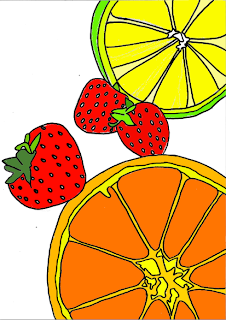
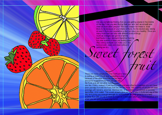
This is my final page spread for the magazine. I chose to do the fruit because it has more colour and there is more you can do with fruits than fatty foods. I drew the image on the left hand side and edited it in photoshop. Here are the steps of how i put it together.
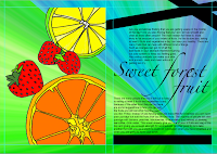
1. I originally wanted my page to look like this so I firstly changed the title from 'Title' to 'Sweet forest fruit'. I then typed in the text and re-arranged the wording so it would fit in well on the page.

I then drew out on a plain sheet of A4 paper the design i want on my page spread which was fruits. I wanted to do something simple so i just drew an orange, some strawberries and a lime. I first drew it in pencil but i then went over it in a black felt tip pen.

 Then i wanted to make a background so i could decide whether the layout looked better as plain white or with a background. To do this i opened a new page in photoshop and chose the gradient tool. I then came out firstly with blue and orange but i wanted to be able to change the colours. So i rasterized it, and changed the hue/saturation to get these colours.


It's good to see you've explained about the background. Personally I think the first version with the reds and greens works best as it blends with the colours of the fruits.
ReplyDeleteIt would be worth seeing how it looks with the opacity down a bit on the background (found at the top of the layers box). This should make the fruit stand out a little more as the background is very bright.